Container queries in Tailwind CSS
Tailwind CSS v4 continues to pull previously plugin-dependent features into the core framework. This post covers useful additions: container queries, max-width variants and the new container-size utility, added in Tailwind CSS v4.3.0 (May 2026).
Container Queries
Container queries allow you to build container-based UI behaviour and change styles when a parent container’s dimensions change.
To use them in Tailwind CSS v3 you needed the separate @tailwindcss/container-queries package.
But since v4 a single @container utility turns any element into a query container and descendants can respond to its size using @sm:*, @md:*, @lg:*, etc.
When styles depend on a specific ancestor rather than the nearest query container, it’s possible to name containers using the @container/name syntax and @xl/name:* variants.
ℹ️ Media queries respond to the viewport. Container queries respond to the space a component actually occupies.
ℹ️ You can check browser support for container queries on Can I Use.
Container Queries vs Media Queries
A media query watches the browser viewport. This works well for page-level layout decisions, such as showing a sidebar or hiding a navbar, but breaks down for reusable components.
Imagine you build a card component that switches from a stacked layout to a two-column layout at md:*. It looks correct in a full-width grid, but when you drop the same card into a sidebar column, which is much narrower, it becomes cramped. Previously, this required writing custom styles.
With container queries you just mark a parent with the @container utility, and use @-prefixed variants like @sm:*, @md:*, @lg:* to respond to that element’s width instead. The same card component will now behave correctly whether it’s in a sidebar, a full-width grid, or a modal, because it reads its own available space.
If you read my article on a mobile device, you can rotate it to landscape to make viewport width wider and see the difference in behaviour.
Max-width variants
Another feature available since the release of Tailwind CSS v4 is max-width variants.
@max-*: lets you invert the logic and apply styles when a container is smaller than a breakpoint rather than larger, similar to how we write @media (max-width: 767px) { ... } in plain CSS.
This is useful for compact states: dense data tables, embedded widgets, or sidebars where you want a stripped-down UI by default and only expand it when space allows.
Combining max-width variants with container queries gives us more ways to control style breakpoints.
<article class="@container">
  <div class="grid grid-cols-3 gap-4 @max-[500px]:grid-cols-1">
    <div class="bg-blue-200 p-4">Item 1</div>
    <div class="bg-blue-300 p-4">Item 2</div>
    <div class="bg-blue-400 p-4">Item 3</div>
  </div>
</article>
This creates a more component-oriented approach to responsive design because behaviour depends on the component’s available space rather than the viewport.
@container-size
The container-based queries discussed above control styles based on element width, using the inline-size value for the container-type property. Previously, using other values of this property required arbitrary values, but since the release of 4.3.0, the new utility @container-size was added. It maps to container-type: size and establishes a query container for both width and height queries.
It can be useful for height-based responsive layouts, adaptive dashboards, resizable panels, and self-adjusting components.
ℹ️
@container-sizeis only available in Tailwind CSS v4.3.0, so arbitrary values should be used in previous versions.
Although @container-size makes an element queryable by both width and height, Tailwind CSS does not currently provide built-in height-based container query variants like @min-h-* or @max-h-*. Height queries need to be written as arbitrary container query variants. For example, [@container_(height>384px)]:flex-col.
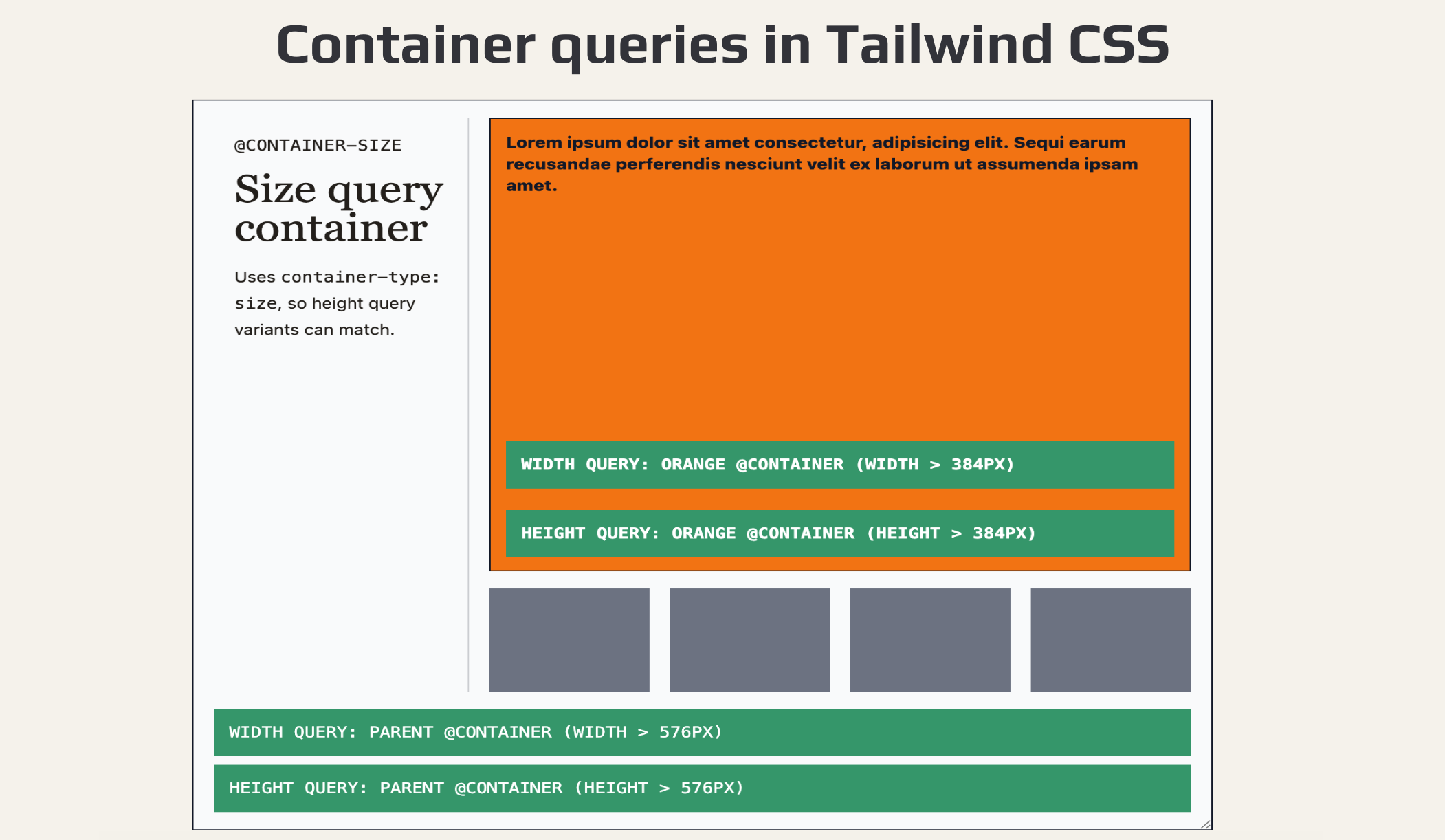
Let’s create an example using named containers and the new @container-size utility.
<article class="@container-size/base">
<div class="grid min-h-full gap-4 grid-cols-[200px_1fr] grid-rows-[1fr_auto]">
<div>
<p>@container-size</p>
<h2>Size query container</h2>
<p>Uses <code>container-type: size</code>, so height query variants can match</p>
</div>
<div class="flex flex-col gap-4">
<div class="@container-size/orangeblock flex flex-col flex-1 bg-orange-500">
<div class="flex-1">
Lorem ipsum dolor sit amet consectetur, adipisicing elit. Sequi earum recusandae perferendis nesciunt velit ex laborum ut assumenda ipsam amet.
</div>
<div class="bg-red-600 @sm/orangeblock:bg-emerald-600">
Width query: orange @container (width > 384px)
</div>
<div class="bg-red-600 [@container_orangeblock_(height>384px)]:bg-emerald-600">
Height query: orange @container (height > 384px)
</div>
</div>
<div class="flex gap-4 flex-row h-24">
<span class="size-full bg-gray-500" />
<span class="size-full bg-gray-500" />
<span class="size-full bg-gray-500" />
<span class="size-full bg-gray-500" />
</div>
</div>
<div class="col-span-2 w-full">
<div class="bg-red-600 @xl/base:bg-emerald-600">
Width query: parent @container (width > 576px)
</div>
<div class="bg-red-600 [@container_base_(height>576px)]:bg-emerald-600">
Height query: parent @container (height > 576px)
</div>
</div>
</div>
</article>
Use @container when you only care about width-based container queries. Use @container-size when the container’s height or block size matters too.
Once components can respond to their own container size, Tailwind’s new max-width container variants become much more powerful because responsive behaviour no longer needs to depend on the viewport alone.
CSS container queries are also expanding beyond size queries, including scroll-state and anchored container queries. Tailwind’s built-in container utilities currently focus on size-based containers, so reach for plain CSS as a progressive enhancement when you need those newer query types.
With @container, @container-size, and the new @max-*: variants, Tailwind CSS v4 makes responsive components significantly easier to build without extra plugins or custom CSS.
Further reading: Tailwind CSS blog · GitHub CHANGELOG · Tailwind CSS documentation